Audience feedback: Questionnaire results question #7
February 5, 2012
After my target audience filled out my questionnaire I gathered the results. For the last question there was the opportunity for my demographic to add any extra thoughts of theirs. Below I’ve presented what they said using the online interactive speaking tool, Voki.
I think that these examples give a clear response of what is good about the three parts of the magazine as well as improvements that could be made.
Audience feedback: Questionnaire results question #6
February 5, 2012
After my target audience filled out my questionnaire I gathered the results. Here are the results for the sixth question.
These results indicate to me that quite a few of the people who took my questionnaire didn’t like the choice of colours on the double page spread, as it’s all quite low key. For the “other” category they said that I could have made the spread more eye-catching.
Audience feedback: Questionnaire results question #5
February 5, 2012
Audience feedback: Questionnaire results question #4
February 5, 2012
After my target audience filled out my questionnaire I gathered the results. Here are the results for the fourth question.
These results show that the around half of the people who took my questionnaire didn’t really like the colours. The “other” result told me that the majority of my audience thought that there was too much information for the page.
Audience feedback: Questionnaire results question #3
February 5, 2012
After my target audience filled out my questionnaire I gathered the results. Here are the results for the third question.
From these results I understand that the choices I made with the fonts, images and layout all proved popular with my demographic. This shows that the contents page was effective in these three respects.
Audience feedback: Questionnaire results question #2
February 5, 2012
After my target audience filled out my questionnaire I gathered the results. Here are the results for the second question.
From the results I can tell that my audience thought I needed to improve the layout of the front page. For the “other” result, they said that I could have added some more information.


Commentary and critical response analysing audience feedback
February 5, 2012
After gathering my audience’s thoughts and recording the feedback I am ready to comment and critique on the results.
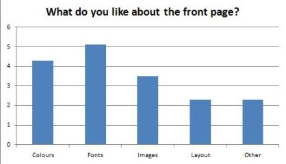
For the first question’s results, I agree with the majority’s idea that the fonts and colours were effective, as I carefully selected these when designing.
For the second question’s results, I agree that the layout could have been better, however this was difficult as the front page’s main image wasn’t especially easy to work around.
The third question’s results were quite unanimous; the choices of fonts, images and layout were all popular. I agree with this as I took careful consideration in the process of designing and producing the contents page.
The results for the fourth question showed that I could have used an extended range or a variety of colours, which I agree with. However I don’t agree with the contents page having too much information for the page, as I think that the information on their is necessary.
For the results of the fifth question, I agree with the results as the layout and images of the double page spread were eye-catching and I spent time developing it thoroughly.
For the sixth question’s results, I agree with the fact that the choice of colours on the double page spread were limiting, and that is something that I could improve upon. I also generally agree with the idea that it could be made more eye-catching, however I may have to go back to the design stage to achieve this.
Tagged: analysing, audience feedback, commentary, critical response